Analyse your health with Python and Apple Health
Tired of learning data science with iris flowers and maritime disasters? Let’s give your health data a try.
Right now, it feels somewhat pointless to describe the impact of mobile phones on our lives. No matter where we are, our inseparable companions allow us to make phone calls, write messages, browse de internet, play games and so on. The list of possibilities is endless and grows every day.
Another important aspect is the fact that they come with a wide array of hardware sensors (e.g. GPS, accelerometer, gyroscope) that, in conjunction with the software, track almost every aspect of our lives. Besides, their data collection capability expands even further with the arrival of the wearables.
If you are an Apple user, you probably know about Apple Health. It is an iOS feature that monitors and organizes health-related data. It consolidates data gathered by the Apple ecosystem and third-party devices and apps. Depending on your specific setup, it may offer valuable insights on your physical activity, body measurements, sleep habits, heart rate, hearing, nutrition, blood glucose or even menstrual cycle, to give a few examples. While some metrics are simple such as the number of steps, others are more elaborated as the ratios of double-support time or asymmetry while we walk.
These tools have raised privacy concerns as they exploit and potentially expose sensitive data. Even with user consent, how safe our records are? Do these features constitute an opportunity for self-awareness or just another form of abuse? How can we leverage them for scientific research? While undoubtedly it is a fascinating debate, it exceeds the scope of this piece.
In this article, we are going to download and explore our own health records. If you are using someone else’s, please act responsibly and ensure that you have their consent before you proceed. From a data science standpoint, these comprehensive datasets constitute a golden opportunity for research and increasing our self-knowledge, that is, understanding better how we live. If you are studying data science, there is another advantage: this is actual data from you. Isn’t it wonderful to apply all you have learnt to real data and derive an actionable conclusion that may improve your own life? Don’t get me wrong, those popular datasets (e.g. Iris, Titanic) are tremendously educational, but they are not that practical. Conversely, these health and lifelogging data sources can provide interesting, motivational and actionable examples. It is worth giving them a try!
1. Downloading the dataset
First, we are downloading the dataset. It requires a few manual steps:
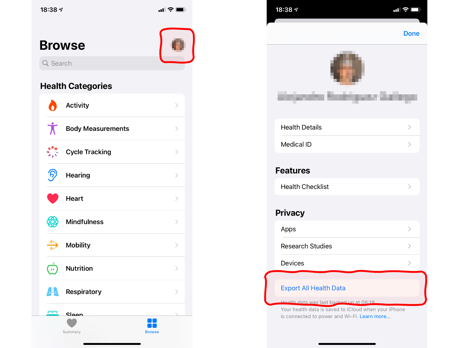
- Open the Health app on your phone.
- Touch the profile picture on the top-right corner.
- Touch Export All Health Data at the bottom of the next screen.
- You will be presented with several options to share the resulting zip file. Choose the most convenient for you, such as an email to yourself.
- On your desktop, unzip the attached archive.
2. Processing the XML into a DataFrame
From the two files inside the archive, the one named export.xml has the data we need. It is easy to transform it into a pandas DataFrame with just a few lines of code and standard packages. There is no need to install anything else. So let’s open a Jupyter notebook and run this:
import xml.etree.ElementTree as ET
import pandas as pd

# create element tree object
tree = ET.parse('apple_health_export/export.xml')

# for every health record, extract the attributes into a dictionary (columns). Then create a list (rows).
root = tree.getroot()
record_list = [x.attrib for x in root.iter('Record')]

# create DataFrame from a list (rows) of dictionaries (columns)
data = pd.DataFrame(record_list)

# proper type to dates
for col in ['creationDate', 'startDate', 'endDate']:
    data[col] = pd.to_datetime(data[col])

# value is numeric, NaN if fails
data['value'] = pd.to_numeric(data['value'], errors='coerce')

# some records do not measure anything, just count occurences
# filling with 1.0 (= one time) makes it easier to aggregate
data['value'] = data['value'].fillna(1.0)

# shorter observation names: use vectorized replace function
data['type'] = data['type'].str.replace('HKQuantityTypeIdentifier', '')
data['type'] = data['type'].str.replace('HKCategoryTypeIdentifier', '')
The code above parses the XML using the ElementTree in the xml module. The file structure is quite simple, a sequence of items with some attributes. First, we turn the XML into a list (one item per observation) of dictionaries (one entry per attribute). Second, we transform those into a DataFrame, mapping the list to the rows and the dictionaries to the columns. Next, we adjust the data types, which is especially important for dates and measures. Last, since the labels for the observation types are quite large, we shorten them by keeping just the trailing part of the identifiers (e.g. HKQuantityTypeIdentifierBodyMass is translated into just BodyMass).
And it is done: we have a neat DataFrame with all our health records in long-format! To check the range of available measures, just execute data.type.unique() to get the distinct values of the column type. It depends on your case, but typically you will get labels such as StepCount, DistanceWalkingRunning or FlightsClimbed, to name a few.
3. Pivot and resample
To analyse the data comfortably, it is preferable to switch to a table in a wide-format. Besides, seeing that the data is sparse, it is also convenient to aggregate them into months. The result would be a table with one row per month and the measures in columns. The example code below only aggregates BodyMass and DistanceWalkingRunning. The specific columns you need depend on the data available in your case and your particular research question. Please note that every measure requires its own aggregation strategy. For instance, we should sum all observations within the period to calculate the total monthly walking distance. Conversely, to calculate the average weight, we should apply a mean (imported from numpy) and not a sum.
import numpy as np

# pivot and resample
pivot_df = data.pivot_table(index='endDate', columns='type', values='value')
df = pivot_df.resample('M').agg({'BodyMass' : np.mean,
                                 'DistanceWalkingRunning' : sum})
4. Add external data and synthetic variables
While we can accomplish many things with the pivot and long tables alone, our analysis gets even more interesting if we add data external to Apple Health or create synthetic variables:
# calculate monthly difference in weight
df['Delta'] = df['BodyMass'].diff()

# dummy: 1 during covid lockdown, 0 otherwise
df['covid'] = 0
df.loc[(df.index > '20200301') & (df.index < '20200701'), 'covid'] = 1

# dummy: 1 during christmas holidays, 0 otherwise
df['christmas'] = 0
df.loc[(df.index.month == 12) | (df.index.month == 1), 'christmas'] = 1

# dummy: 1 during phd studies, 0 otherwise
df['phd'] = 0
df.loc[df.index > '20180901', 'phd'] = 1
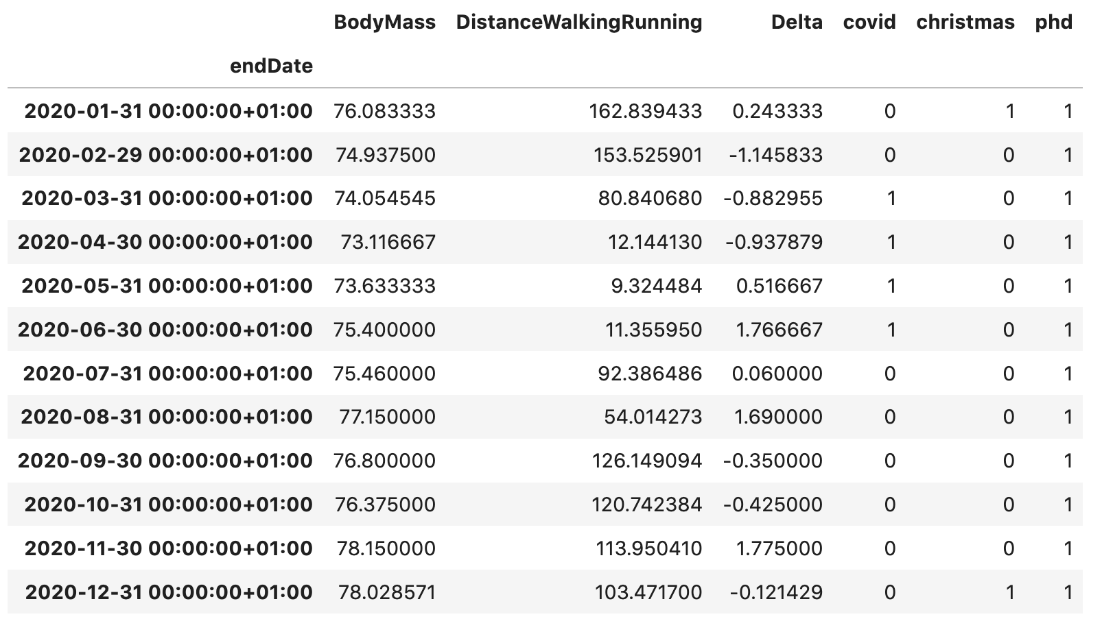
A variable is synthetic if it is not obtained by direct measurement. Let’s calculate the monthly difference in my weight (more on that in a moment). As external data, I am including three dummy variables that will mark some relevant events in my life. They will be set to one in the months when the related events take place and zero otherwise. For example, covid indicates the first COVID-19 lockdown in my country (when mobility was significantly reduced), phd underlines the duration of my PhD degree and christmas highlights the winter holidays period (i.e. December and January). As a result, the final table looks like this:
5. Research question: What factors affect my weight?
Now on to the interesting part, let’s make all pieces fit together and extract valuable insight from the data. As a first approach to the problem, we are plotting the BodyMass monthly time series:
# for jupyter notebooks
%matplotlib inline
%config InlineBackend.figure_format = 'svg' # ‘png’, ‘retina’, ‘jpeg’, ‘svg’, ‘pdf’

import seaborn as sns
import matplotlib.pyplot as plt

# body mass time series
fig = plt.figure(figsize=(12,4))
sns.lineplot(data=df['BodyMass'], color='purple', linewidth=1)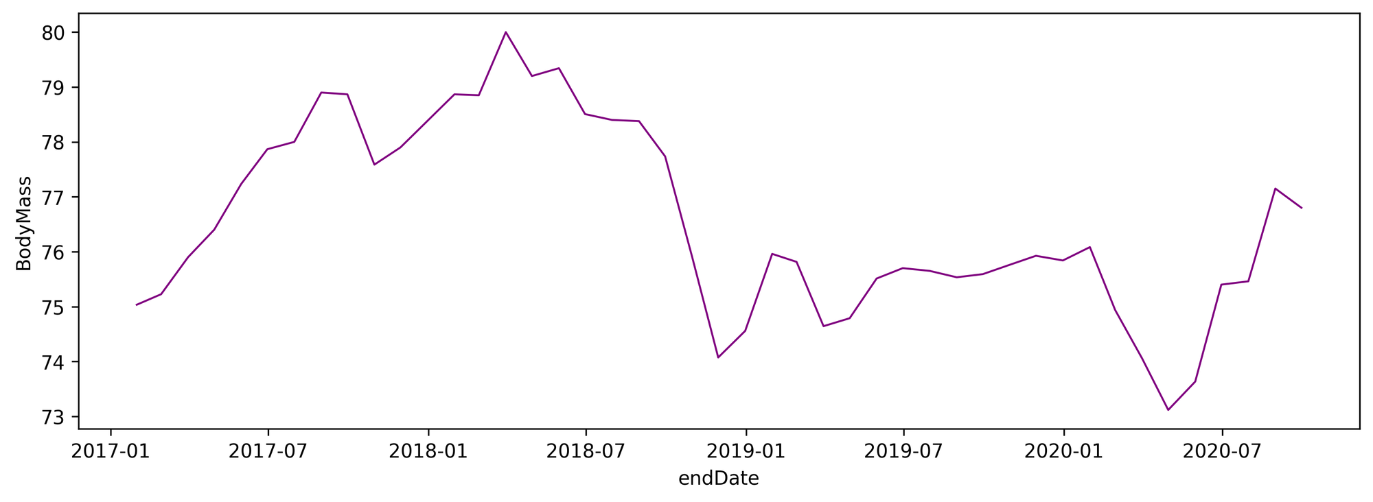
My weight does not remain constant over the years. What factors may influence it? A simple mat
hematical model to explain the changes could be the following:
\[\Delta BM_t = BM_t - BM_{t-1} = \alpha + \beta_1 \cdot F_{1t} + \beta_2 \cdot F_{2t} + \cdots + \beta_n \cdot F_{nt} + \epsilon\]
The left side of the equation is the monthly change in BodyMass (Delta thereafter). On the right, there are a constant, a linear combination of factors and an error term. Which factors? In the dataset we have DistanceWalkingRunning and the dummies phd, covid and christmas. Let’s try these.
The plot below shows the time series of the monthly differences in BodyMass and, next to it, the density function.
# differences in body mass time series and density
fig = plt.figure(figsize=(12,4))

# place and size subplots
ax1 = plt.subplot2grid(shape=(1, 4), loc=(0, 0), colspan=3)
ax2 = plt.subplot2grid(shape=(1, 4), loc=(0, 3), colspan=1)

# the plots
sns.lineplot(ax=ax1, data=df['Delta'], color='purple', linewidth=1)
sns.kdeplot(data=df2, y='Delta', color='purple', fill=True, label='', ax=ax2)

# some cosmetic changes
ax1.axhline(y=0.0, color='black', linestyle='--', linewidth=1)
ax2.axhline(y=0.0, color='black', linestyle='--', linewidth=1)
ax2.axes.yaxis.set_visible(False)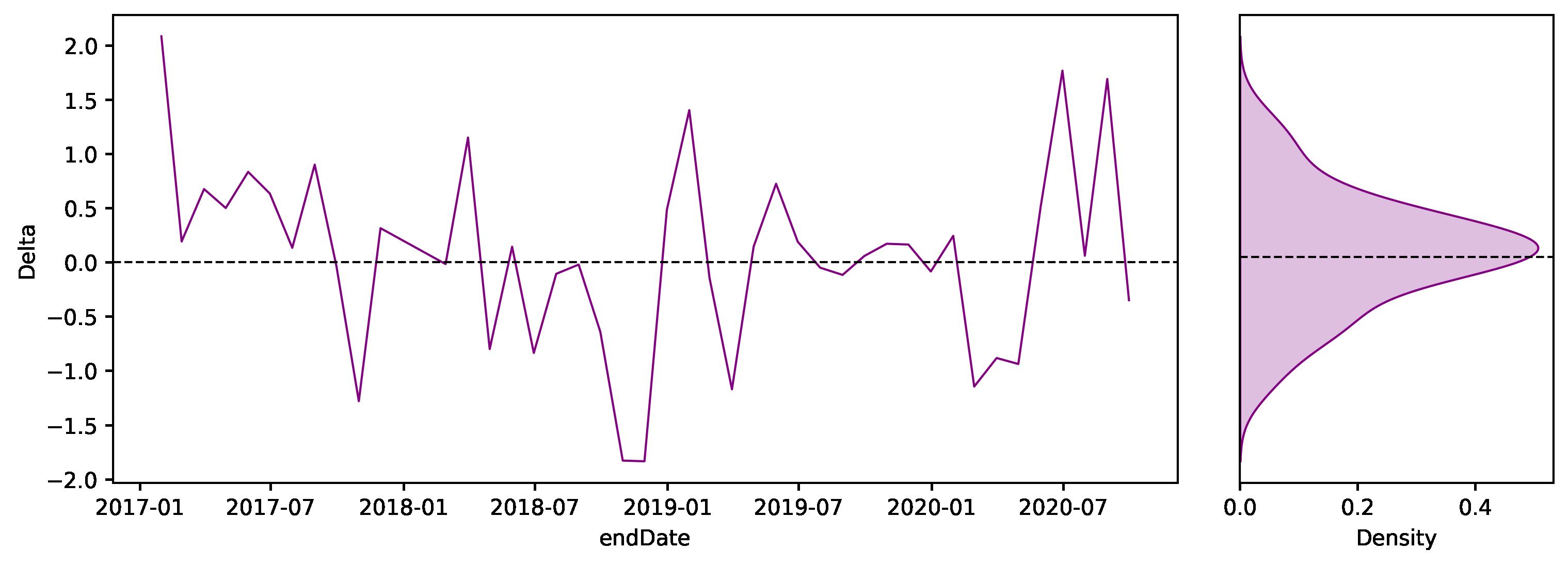
6. Correlation matrix
A correlation matrix is a convenient way to summarize the correlations between all variables in a dataset. In addition to the numbers, we can plot a heat map to make it more visually appealing. The variables with positive correlation are displayed in blue, while the negative ones are shown in red. It is possible to come to some conclusions with just a glance:
- Delta correlates negatively to the number of steps, distance and PhD. These factors seem to decrease my body mass. The first two because of physical activity, the third most likely due to stress. However, Christmas seems to make me overweight.
- Lockdown negatively affects distance and steps, due to the corresponding restrictions on mobility.
- Steps and distance and strongly correlated.
- BodyMass and physical activity are positively correlated. Even though this seems counterintuitive, it actually makes sense: when my body mass is high, I engage in more physical activity to compensate and lose weight.
# correlation matrix
cm = df.corr()

# heatmap
fig = plt.figure(figsize=(8,6))
sns.heatmap(cm, annot=True, fmt=".2f", vmin=-1.0, vmax=+1.0, cmap='Spectral')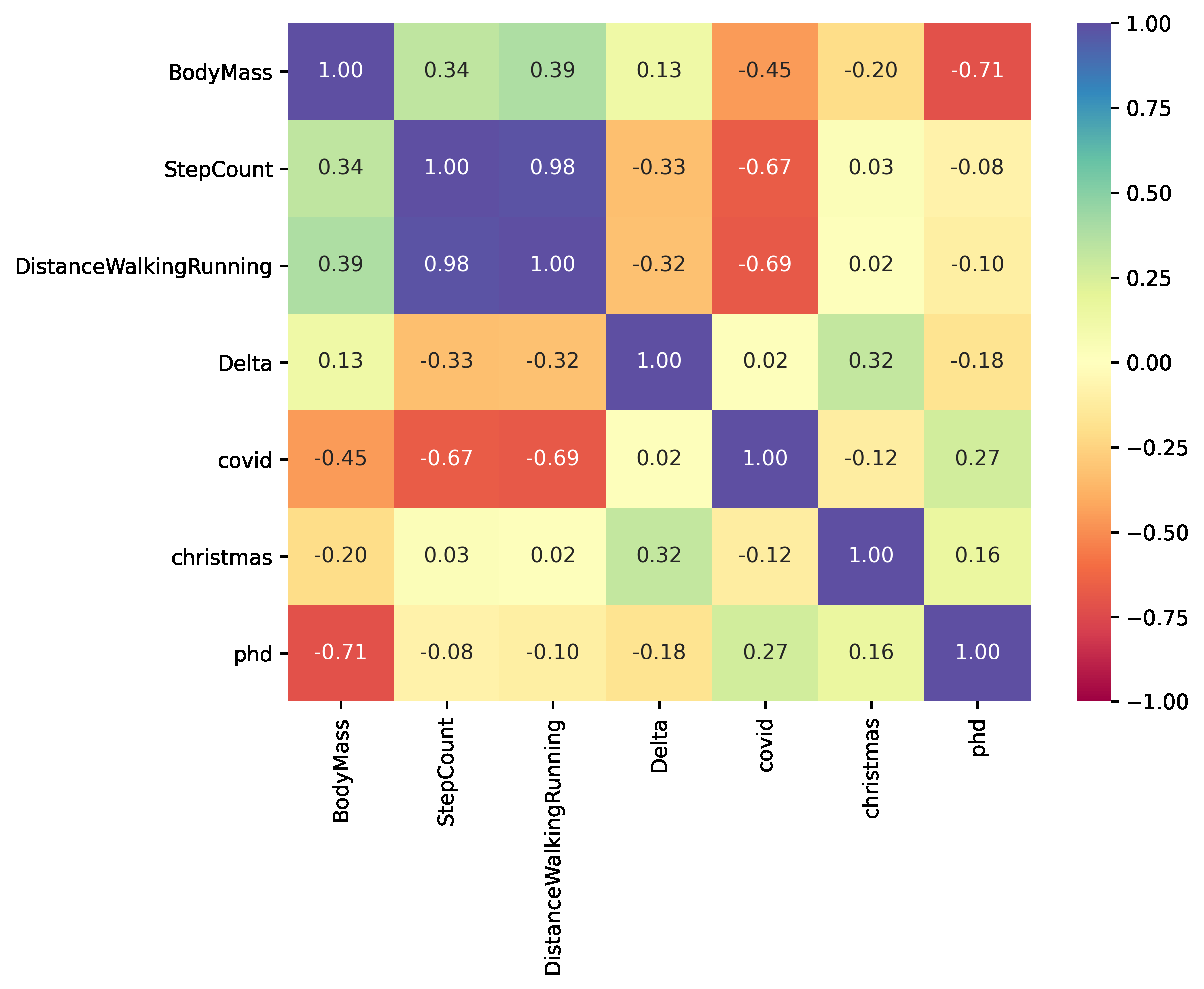
7. Pair plot
Another effective representation is a pair plot. It maps each variable onto a column and row in a grid of bivariate and univariate plots. In this case, the diagonal shows the density of each variable, while the upper and lower triangles describe the pairwise relationships between variables with a scatter plot and some Kernel Density Estimation (KDE) contour lines. Let’s plot the variables with the most intense relationship:
# pairwise plot
fig = plt.figure(figsize=(12, 12))

g = sns.pairplot(df[['Delta', 'DistanceWalkingRunning', 'christmas']],
             kind='kde',
             plot_kws=dict(fill=False, color='purple', linewidths=1),
             diag_kws=dict(fill=False, color='purple', linewidth=1))

# add observation dots
g.map_offdiag(sns.scatterplot, marker='.', color='black')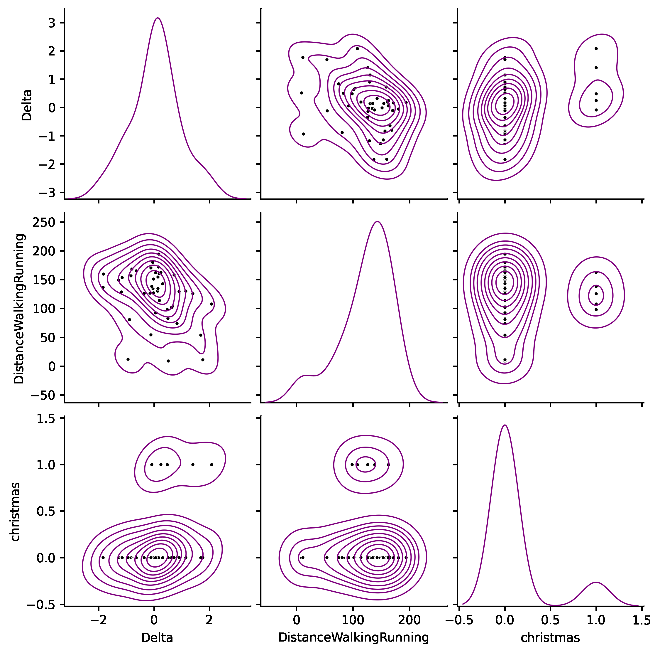
If we focus just on the first row, Delta is the ordinate and the other variables are the abscissas. The leftmost plot is the probability distribution of Delta, which we have already displayed before. The following two show the relationship between Delta and DistanceWalkingRunning and christmas. We appreciate a clear slope in both charts.
8. Linear Regression
Plots are great exploratory tools to approach the problem. However, to reach more meaningful conclusions, we need to measure the strength of the effect and the statistical significance. With that goal in mind, we are calculating anOrdinary Least Squares(OLS) regression:
import statsmodels.formula.api as smf

# OLS regression
model = smf.ols('Delta ~ 1 + DistanceWalkingRunning + phd + christmas + covid', data=df.dropna())
results = model.fit()
results.summary()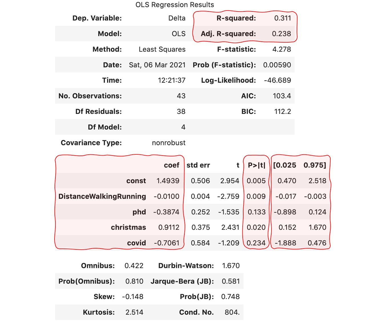
The result contains a plethora of figures that come in very handy to better understand the problem:
- The coefficient of determination, R squared, measures the amount of the variance in the dependent variable that is predicted by the independent variables. The higher, the better. Our 0.31 is reasonable but far from the maximum of 1.0. The adjusted version accounts for the spurious results as the number of explanatory variables increases.
- The regression coefficients measure the amount and direction of the effect. For example, I gain about 0.911 kilograms per month during christmas, or I may lose 1 Kilogram per month if I traverse 3 Kilometers per day.
- The p-value answers another interesting question: are we sure that the coefficients are not zero? To reject the null hypothesis, we need p-values inferior to the critical value. In this example, let’s set it to 5%. Consequently, we should only take into consideration the values for the constant, DistanceWalkingRunning and christmas.
- The confidence interval at 95% provides the most probable range for each of the coefficients.
Final words
If you are old enough, sure that you can remember a time when computers were no match for today’s smartphones in terms of processing power and versatility. Nowadays, these devices accompany us everywhere and keep a record of our personal life. While privacy is a legitimate concern in this scenario, our duty as data scientists is to leverage the data available into something useful for individuals, organizations and society as a whole. In the process, we must act responsibly.
Health data provides valuable insight into a person’s life. In this post, we have learnt to easily retrieve that data from our phone and (hopefully) draw some interesting conclusions.
The possibilities are endless! Besides, if you are a student, this tutorial allows you to practice your skills on real data that is meaningful to you. The limit is your imagination.
I look forward to your comments, and thank you for reading!


